New in Microsoft Excel 2016

Microsoft Excel 2013 logo

Like Access 2016, Excel 2016 is on the face of it very similar to its 2013 predecessor, but has a few tools and shortcuts added to make your life easier, plus the exciting advance in multi-user capabilities for Office 365 users.


1. Multi-user capability

There is a very significant development in Excel 2016 when working in Office 365 - for the first time you can have multiple users editing a file at the same time. The lack of multi-user capability has long been a bug-bear in Excel so this is a potentially very useful update.

There are a few caveats here in that this feature does not apply globally. Firstly, the file you are working on has to be stored in OneDrive. Secondly, you all have to be editing it using the online version of Excel – i.e. the one that opens automatically if you log into OneDrive online and open an Excel file. In this mode, edits made by each user are seen in real time by other people using the file. Be aware though that when using Excel Online, changes are saved to the file immediately, without choosing to click “Save”. Apparently you can also use your SharePoint site by connecting the OneDrive to your SharePoint site.

One further point to note is that it is possible to sync your OneDrive to your computer so that it becomes a standard folder on your PC. When you open Excel files through this route, you end up using your offline, full copy of Excel rather than the Online version. If you do this, the file no longer syncs automatically with the other users. Instead you end up with your own copy of the file, and they have their online copy – which could become very messy!

(If you are considering Office 365 or would like to know more, click here.)


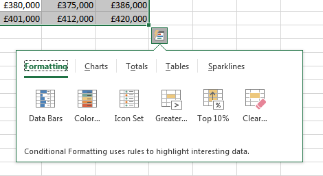
2. Quick Analysis tool

This is nothing major, but is neat and can be useful. Highlight a range of data, then click on the new icon that appears at the bottom-right of the highlighted fields. There are options to format the data, perform quick calculations and more.

Microsoft Excel 2016 Quick Analysis


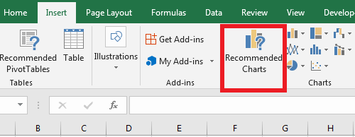
3. Recommended Charts

The idea is that Excel suggests a few types of chart that it thinks best display the data selected, although in our experience you often need to change the charts around anyway to get them just how you want. It's a new button on the 'Insert' ribbon if you want to try it out.

Microsoft Excel 2016 Recommended Charts


4. One-Click Forecasting

Perhaps a more beneficial new tool, One-Click Forecasting uses the Exponential Smoothing (ETS) algorithm to plot future trends by extrapolating historic time-based data, for example monthly sales, on a line or column graph. One-Click Forecasting has the ability to account for seasonality and give upper and lower confidence bounds, all even if as much as 30% of the original data points are missing.

Microsoft Excel 2016 One-Click Forecasting
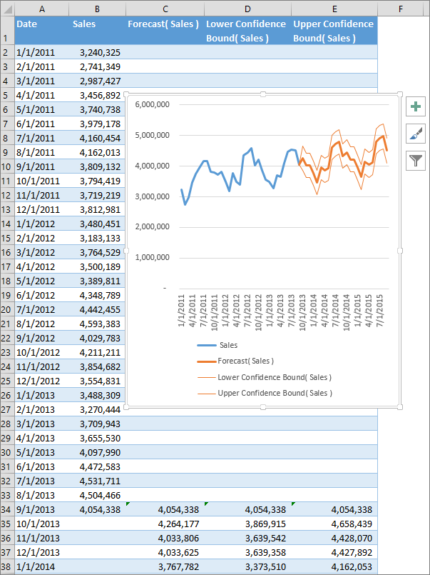
Please note: dates are in US format.


5. New chart types

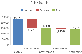
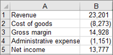
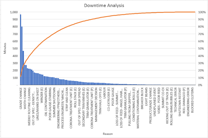
There are new ways to display data visually, because six types of chart have been added:

Microsoft Excel 2016 sunburst chartMicrosoft Excel 2016 sunburst data
  • Sunburst - a pie chart with multiple rings, great for hierarchical data. Suppose we have the yearly sales data in the table to the right, with a breakdown for each of the three months within any quarter, with February's data then split into each week. The sunburst chart cleverly uses colours and the different layers of ring to display clearly the quarterly, monthly and weekly variations.

  • Microsoft Excel 2016 treemap chart and data
  • Treemap - similar to sunburst but rectangular not circular. In the example to the right, breakfast sales are blue; lunch sales are orange. But the chart also splits further to show how much each item of food/drink contributes to the sales for that meal; the area for an item is proportional to the sales for that item. Note that the treemap fails to display the categories in the middle level of the hierarchy, in this case 'Food' and 'Drink', whereas a sunburst chart would be able to display this.


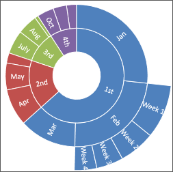
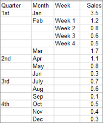
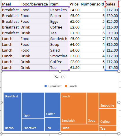
  • For more information on Sunburst and Treemap charts, and when it's best to use each type, please click here to read a Microsoft article about them.


    Microsoft Excel 2016 waterfall chartMicrosoft Excel 2016 waterfall data
  • Waterfall - most likely to be used for displaying financial data. For example, the table to the right shows the values of various financial terms. The user selects for each term whether it is an increase (e.g. revenue), a decrease (e.g. costs) or a total (e.g. net income), and the waterfall chart then displays a financial summary. Here you can see the sales (revenue) dropping down to gross profit (Gross margin) after taking off the cost of goods, and then dropping again down to net profit (Net income) after taking off the overheads (Administration).

  • Microsoft Excel 2016 histogram chart and data
  • Histogram - a column chart for displaying frequency of data categories. In the example to the right, the chart displays the analysis of sales figures per sales rep of a company. For example, it shows that six reps have a figure between £0 and £5000. It's very easy to adjust the number of columns, or range of each column, by right-clicking on the horizontal axis, then clicking 'Format Axis', then the column chart icon ('Axis Options') from the pane on the right-hand side.


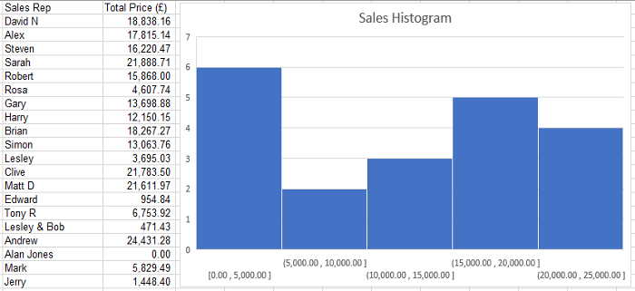
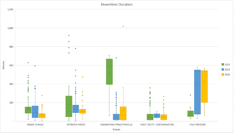
  • For lots more information about histograms and how to create and use them in Excel, see our short YouTube Histograms tutorial.


    And for an Excel file containing example histograms, use our download form.


  • Pareto - a sorted histogram chart that also has a line showing the cumulative total percentage. In the example below, we have a snippet from a large table showing many instances when a factory production line has had downtime, and for each instance the duration of the downtime and the reason. The chart shows which of the reasons cause the most downtime. The line could be useful, say, in showing that 80% of all downtime is caused by reasons listed to the left of 'strip and clean'.
  • Microsoft Excel 2016 pareto chartMicrosoft Excel 2016 pareto data

  • Box and Whisker - useful way of showing and comparing the mean, median, interquartile range and outliers of one or more categories of data. Again using the downtime analysis data as an example (see Pareto above), this time we are able to display more detail about 5 chosen reasons, including how the durations per instance of each reason vary by year. The cross within each box is the mean downtime per instance of that reason for that year; the line across the box is the median. So, for example, you can see that the company significantly improved the length of downtime caused by each Engineering incident from 2013 to 2014. Note that the chart does not show the frequency of each reason, and therefore does not show the total disruptiveness of each reason.
  • Microsoft Excel 2016 box and whisker chartMicrosoft Excel 2016 box and whisker data


    Software-Matters have been experts in bespoke Excel systems since 1995.

    Find out more about how we can help you with your project by emailing us via our Contact page or giving us a call on 01747 822616. We give free advice!

    If you would like to read more about the different Excel versions follow the links below.

    If you enjoyed this article or found it useful, why not tell others about it?Tweet

    Don't just take our word for it...

    "I would like to say thanks to yourself and your team for all your hard work.
    We are very happy with the quoting system; for the first time ever we are looking at a system in which we have confidence."

    Steve Ringsell, CFN Packaging

    scroll to top - icon